Quick and dirty usability testing of OSM
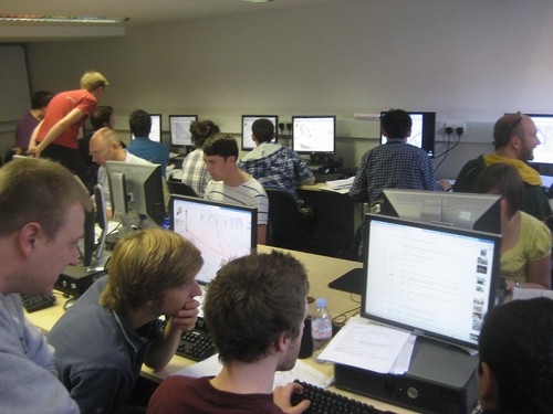
Last week I joined Ant and Deb from MapQuest in order to help out with the UCL mapping party. On the Wednesday I went out with some new Masters students and got soaked in the rain around Camden, but the main interest for me was the following day when we all gathered in the computer lab to uploaded the newly collected data. While I was helping out I was also scribbling furiously whenever I found someone stuck on some aspect of OSM that I hadn't expected.
I was briefly worried that there would be a flurry of activity while they logged on and that I'd miss most of it, but actually the account creation was so long and tortuous that it gave me plenty of time to watch. Silver linings, etc, I guess. I took notes, and so here they are, in the order I wrote them down.
- Where did the email go? - The biggest hurdle and the one that spread them out was confirming their email. Given that the OSM servers are on the same campus as we were, it took an extraordinary amount of time for them to appear. But the issue here was that on the user signup page there was no indication as to which email address the confirmation email was sent to, and one person was worried there was a typo. It also made it impossible for me to check that there wasn't a typo in their (to them) brand new address.
- Nobody reads the CTs, and everyone ticks the PD box without reading it either - I'll win no friends with this observation, but I saw nobody scrolling the CTs box, and everyone reflexively ticked the box beside the agree button. I'm guessing they all thought it was a "have you read the above legal stuff" which you normally get on such forms.
- Send another confirmation email - There's no way to trigger sending another copy of the confirmation email. Sometimes they go missing, and at least if there was a button the frustration levels would go down.
- Not obvious what the settings page is for - After confirming their email the users end up on the settings page, where almost the first thing it shows you is your email address and a box to put a new email address into. That confused a lot of people. Things like add a friend, set a home location, read some getting started notes etc would be more useful
- Highlight unrecognised tags - I found one guy who had, and it's not clear how, ended up with all his name tags with a capital N. These would be better highlighted while editing that it's an unexpected tag.
- Anxiety over tags missing from autocomplete lists - on two occasions I had people worried that what they were typing (in both cases "office") wasn't in the autocomplete list. I had to explain that there are things on Map Features (and elsewhere on the wiki) that aren't in the list, and that's not a problem.
- Confusion over the preset dropdown (10a and 10b on this image) Three people struggled to make it stay open (i.e. click - hold - move - release). One guy kept selecting different things, and didn't realise it was adding more tags and changing one (amenity) that he'd already set, until I pointed it out. I had to explain the small icon (10a) was a button that changed what was on the dropdown. Most of the icons used in 10a weren't understood (car and bike were good, the football and postbox less so). Many people made the same mistake of adding a POI, adding the correct tags, and then worrying that it said "(no preset)" and tried to find the correct thing in the menu - i.e. misunderstood the purpose of it.
- Couldn't find double-click - Since they were entering POIs they'd already collected, they rapidly found themselves without an appropriate one on the POI panel and searched the wiki. With the tags in hand, they were then stumped on how to add a blank POI. One guy worked out he could change the tags on an existing one, but either instructions ("double click") or a multi-purpose / "blank" POI icon would be better.
- Couldn't add extra tags - three or four times people needed the + icon pointed out to them
- Map Features - long descriptions - most people found themselves on Map Features reading the key, value and short description, but I didn't see anyone realise that they could click the value for more details. This should perhaps go (automatically) onto the end of the short description text as a "More details..." link.
- Confusion with abandoned features - repeatedly people found proposed and/or abandoned features, and similar wiki-works-in-progress. As well as not understanding, they also didn't care, and didn't read the page either - they were just skim-reading to find the tags they needed. I'd lean strongly towards clearing off the 3-year-old abandoned pages, but I realise there are "wiki-historians" who want to keep everything for posterity.
- Search beyond Map Features - most people searched up and down the Map Features page using the browser-based search (Ctrl+F). They were then stuck when they couldn't find the thing they were looking for, and had to be pointed towards the search box to search the rest of the wiki. Again, it wasn't clear that there are plenty of things obscure enough to not be on the main list. Also, "Also known as" and "similar to" and "see also" sections of the tag documentation are worth their weight in gold. A surprising number of pages don't have them.
A lot of the most interesting stuff I found was regarding Potlatch 1, and (fortunately?) very little of it applies to Potlatch2 since the UI has been overhauled. I'd love to also work on the Friends functionality of the website, since when the students started "friending" each other, pretty much nothing happened. We could show friends edits, diary entries etc. One thing that stood out for me though, was we should remove the PD tickbox from the CTs. It's added confusion if you read it, and most people don't so the point of it is moot. It's not on the critical path for signup so it shouldn't be in the signup flow at all. It can live in the user settings page or somewhere similar. It's not legally binding and it's not working a straw poll either. Finally, it would be great if there was more stuff possible before the email was confirmed, like adding friends - or even links to introduction videos or something like that.
I'll leave you with the best and least-expected I-never-thought-of-that example of the day. I watched one student find the entry in Map Features for the shop that he wanted to add. He highlighted the icon, right clicked and selected Copy, then changed tabs to Potlatch and right clicked in order to paste the icon where he wanted it to appear.
If only, my friend, if only.
Thanks to Muki Haklay and Thomas Koukoletsos from UCL for inviting us along. If anyone has any similar opportunities for me to come and watch people learning OSM, please get in touch.
This post was posted on 4 October 2010 and tagged OpenStreetMap