Posts
- “Use the layer switcher to change the map layers” - the layer switcher is hard to find, even when you’re deliberately looking for it. We’re using the default “+” icon on osm.org - the stacked layers icon that I use on opencyclemap.org might be better. But I think best of all would be some rectangular buttons that are always visible. OpenLayers unfortunately makes this surprisingly hard.
- “Set your home location” - this could do with some love. People want to type in their postcode, or at least search, in order to move the map around. I also found that about half a dozen people set their home location, and pressed edit, which opens Potlatch (despite the tab being “greyed out”) at somewhere unexpected.
- “Add the person next to you as a friend” - this was a real head-slap moment when I thought about it. Given two people, sitting side by side, how do they add one another as a friend? If they are lucky, they’ve both set their home location within a hundred metres or so and show up on the list of nearby users. If not, the most straightforward way is to go to their own home page, edit the url, replace their username with the other person’s (case-sensitive) username, and then an “add as friend” link appears among all the other links. There’s so much wrong with this it’s embarrassing - or rather, embarrassing that I put the instructions in without thinking things through! A user search, and a button (rather than a link) to add as a friend, would help for a start.
- Go to www.osm.org. Click help. Admire. Now try to get back to the map, without pressing “Back” or retyping the url.
- Go to help.openstreetmap.org and click on a username. Now try adding them as a friend.
- Go to www.osm.org. Switch to another map layer. Click the map key. Get a blank tab.
- The p2 save dialog has too much text above the changeset comment field. People get bored reading it, I think because they aren’t expecting an interruption when they press save.
- It’s still unclear how to start drawing lines and areas. In fact, most people accidentally start drawing lines, and press escape, without realising later on when they want to draw one that they already know how.
- People want to add icons to points of interest that are already drawn, but as an area. Maybe we should symbolize areas, or even better, prevent icons from being dropped onto existing areas with the same tags.
- People get mightily confused when the icons on the map don’t match the icons on the sidebar. Maybe we need to rethink how the sidebar icons appear.
- Creating other points of interest is hard to figure out (i.e. double-click).
- If you have a large named area, it can be non-obvious (especially when zoomed in) what’s causing the name to appear.
- There’s useful shortcuts (like J) that don’t appear in the help.
- There’s lots of useful actions that don’t have any GUI for them, unless you count documenting the keypresses on the 8th tab of the Help menu!
- You can get to the situation where something hasn’t loaded - either the map, or in some cases map_features, and find yourself in a world of hurt, with no warning.
- One person couldn’t figure out panning the map around while editing. That’s a combination of no buttons, and that if you (tentatively) click on the background, something happens (start drawing a way), so you learn not to click on the background. Of course, to pan the map you need to mousedown to drag it.
- I’ve never seen anyone using the Potlatch 2 search button, but people often use the main search bar while editing. That often leads to pain when they click on the results.
- We need a deselect button. When you have a feature selected it’s not obvious that to deselect you just click somewhere else on the map
- The wiki page on wheelchair mapping is unclear about tagging accessibility of toilets when they are in another amenity (e.g. pub) rather standalone toilets (amenity=toilets)
- One person triggered EntityUI exceptions when zooming in and out. I was surprised to see the exception showing - normally these only show on debug flash plugins
- Still confusion on how to add features that aren’t in the grid of icons (Current solution is to double-click to create a POI, suggestion is to have an “other” poi to drag/drop)
- The conflict dialog, which you see when two people edit the same road, isn’t particularly helpful. It only gives the id of the feature, which doesn’t help. There’s no method to reconcile the differences (or even see what they are). Yes/No labels on the buttons are bad.
- The backgrounds dialog needs better labels. e.g. “Bing Aerial Imagery” since “Bing” is meaningless
- Need to drag/drop “new point” (as above - shows you how often it came up!)
- Maybe need a “More…” button on the presets to provide some way to reassure people they aren’t definitive and show them how to figure things out
- Click-again (that is, clicking twice slowly) should also create a POI
- It’s hard to read the road names, especially when they are at an angle
- Duplicate nodes, when shown, aren’t easily figured out what they mean
- One person made the advanced tag panel go haywire by having multiple new tag entries - and managed it repeatedly
- Wiki documentation on bookmakers still sucks. We ran into this last year - there’s a lot of bookmakers in London, and especially if you know a different term for it (gambling shop etc) the documentation is hard to find
- Would be great to highlight mistakes, e.g. tagging building=yes on a node. This happened a couple of times when people had a node of an area selected when they started adding tags
- Copying tags from nodes to ways (see above)
- Newbies shouldn’t be exposed to the footway vs path controversy on the wiki.
- Nobody ever finds the search box on the wiki, especially when they are using browser-based find on the Map Features page.
- People accidentally mousewheel out too far repeatedly when editing. Maybe we should prevent it at low zooms
- barrier = entrance vs building = entrance is unclear
- Nobody reads past the first paragraph of the Key pages on the wiki before just skim-reading the read. Which means sentences like “Some people use the tag ‘foo = bar’ when they should instead use ‘baz = bar’ becomes “….. ‘foo = bar’ ….” and that gets used.
- The public transport pages on the wiki are dreadful, and newbies shouldn’t be exposed to two alternative tagging schemes. I have my own views on the whole new pointlessly-incompatible schema in any case.
- You can end up with both the rails_port search panel and potlatch 2 open at the same time. If you try closing the search panel you get the “leaving the page” warning, when you aren’t actually leaving the page.
- The “loading….” label isn’t obvious
- Areas of the map that haven’t yet had the data downloaded could be highlighted (or disabled) so that you don’t think it’s just empty.
- We need some way of saying “Zoom in!” when you have too much data showing at the given time and flash is crawling to a halt
- The data loading could be improved by having a tile-based map call instead of the current wms-like map call.
Make the hard things simple, and the simple things occasionally surprisingly hard
I’ve run two OpenStreetMap-themed training courses recently - one for university students, and one for a Local Authority. It’s great helping even more people get started with OpenStreetMap, and as is becoming a bit of theme, I took the opportunity to observe more people getting started with OSM.
Unlike previous outings to UCL, these two sessions had “getting started” notes that I had written - not a click-by-click tutorial, but notes of what things to try in a particular order. This lead to a little embarrassment when some of the seemingly innocuous instructions turned out to be surprisingly hard!
The other things are things I noticed people trying to do, which are perfectly reasonable.
Some maps don’t have a key (I’m guilty of that), but showing an empty panel isn’t helpful. We also found the wrong key appearing beside the different layers, but I can’t reproduce that today. As for the integration with the help centre - I know fine and well how tough it is to integrate separate software products, but users really neither know nor care about it.
And finally some run-of-the-mill observations, mainly of Potlatch 2
One of the things that I want to work on within Potlatch 2 is to (mis)use the sidebar to provide context sensitive help. So I imagine when you’re drawing a way, a little square at the bottom of the sidebar says “You’re drawing a line. Double click to stop drawing, click on another way to create a junction” and so on. I think it’ll be especially useful for the first 10 minutes while people get to grips with things.
But, in saying all this, the feedback I get time and time again is how easy it is to get started with OSM, very rarely do I hear that participants found it hard. We can, however, make it even easier!
This post was posted on 1 March 2012 and tagged OpenStreetMap
TileMill, Carto and the Transport Map
A few months ago I started exploring some new technologies from DevelopmentSeed - namely Carto and TileMill. Carto is a CSS-style map description language, similar to Cascadenik, and TileMill is a browser-based application that lets you view maps while you're designing them.
Initially my efforts were a complete flop - at that point neither Carto nor TileMill had any support for storing the map data in PostGIS, which is a key component of making maps from OSM data. A month later and support was added, so I got cracking - mainly bashing my head against the weirdness of the node package management system NPM. But after a lot of effort and only a little swearing, I got it all working. It's totally worth it.
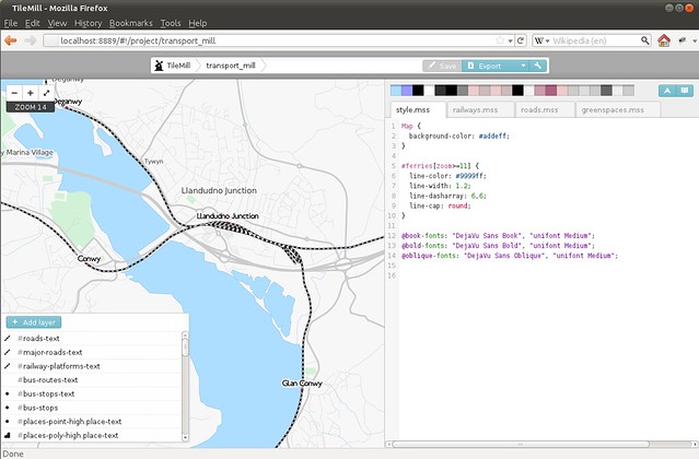
Designing maps is hard - both in the amount of complexity in the style rules (there's lots of colours, widths and so on) and also in the data - every town is different, and the way a map looks varies wildly between town and countryside. So a key thing is to be able to iterate quickly, to make changes and to see how things look in different areas. My previous toolchain - effectively just a modified version of generate_image.py - was a complete pain. To check different areas I'd need to find out the coordinates, pick a zoom level, wait for the image, check it, rinse, lather and repeat. The power of having live-updating maps in TileMill is not to be underestimated!
My first map style produced with Carto and TileMill was the Transport layer. I had originally created the Transport layer using Cascadenik - similar to Carto, it's a CSS-inspired approach to describing map styling, and much easier than writing individual symbolizers in XML. Carto takes the idea another step forward with sophisticated rules nesting, which I've been using more and more in recent months. Since porting the Transport layer, I've ported all my other styles to Carto, but more on that some other time. If you're still creating mapnik style rules by editing XML, I'd advise you check out Carto instead!
This post was posted on 8 February 2012 and tagged General
OpenStreetMap usability revisited
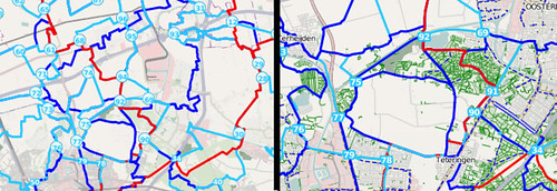
At the end of September I took a half-day off from the day job and visited UCL. They were again running an Introduction to OpenStreetMap Mapping Workshop for their new masters students. I went along last year and created some great notes on usability for OSM newbies and did the same again this year. It’s rare for me to be able to watch (and help) so many newbies at the same time.
The main difference between last year and this have been the move to Potlatch 2 as the main editor, so I was especially looking forward to seeing how this performed. Also the students were this year focussing on wheelchair accessibility mapping, which had implications mainly for the detail of our presets compared to this highly-detailed (and relatively unusual) mapping focus.
So here’s the list of notes that I made, in the order that I made them
Some of these things are familiar from previous user testing, some are new, and some will need a bit of discussion to tackle. This is a good opportunity to plug the upcoming Hack Weekend!
Thanks to Dr Patrick Weber for inviting me along.
This post was posted on 25 October 2011 and tagged General
Dealing with GDAL and Mapnik
Getting GDAL and Mapnik to play nice is a complete pain. Now that I've managed it, I'll give you the solution and explain some of the background.
Mapnik has two plugins for reading image files and using them as background in maps. For OpenCycleMap I currently use the "raster" plugin which reads the files directly, and I need to calculate and supply mapnik with all the coordinates for each image. It's a bit tedious, but when we set up OpenCycleMap a few years ago it was the only way we could get things to work.
Time moves on, and for new projects (and the massive forthcoming OpenCycleMap upgrade) I'm using the "gdal" plugin. This uses the wonderful (but sometimes infuriating) GDAL libraries to read the images and use any geo-information that's embedded within them. Saves a lot of hassle, and when you're dealing with tens of thousands of raster images then things like .vrt files are a godsend.
However, gdal has a secret lurking deep within its sourcecode, and it's all to do with libtiff. libtiff is the library for reading .tif files, which are normally limited to 4Gb in size. There's a new version of libtiff that deals with giant tiff files that are greater than 4Gb (known as BigTIFF). The version of libtiff that comes with Ubuntu doesn't have BigTIFF support, so the GDAL packages use their own internal copy of the library. With version 0.8.0 of gdal, a feature was added to throw an error if multiple versions of gdal were found active at the same time (in 0.8.1 this was downgraded to a warning). But for most applications using gdal there's no big problem - they use the gdal libraries, and hence use the BigTIFF version of libtiff. Meanwhile the standard libtiff (which loads of other things need - trust me, don't try uninstalling it) is left out of the picture and usused.
The problem is if your application - say, mapnik - compiles against both the system libtiff and gdal-with-BigTiff. If you're using gdal before 0.8.0 then you might get silent corruption of the output, if you're using 0.8.0 the mapnik will keep crashing with "ERROR 1: WARNING ! libtiff version mismatch : You're linking against libtiff 3.X but GDAL has been compiled against libtiff >= 4.0.0"
The trick to this is to avoid using any ubuntu packages of gdal - whether from the ubuntugis PPA repositories or anywhere else - until someone somewhere sorts it all out (probably in some future Ubuntu libtiff will have BigTiff support built-in). In the meantime, grab yourself gdal from source (0.8.0 is fine, btw) and configure it with
./configure --with-libtiff=/usr/lib
This forces gdal to use the system libtiff, and prevents any corruptions or segfaults in applications (like mapnik, which you'll need to recompile too). It means you don't get BigTiff support, but hey-ho. But most importantly, you can stop spending all your life juggling gdal versions trying to find which particular combination of packages and PPAs work (hint: none of them do). Thanks to Dane for the final clue - I've spent days of my life repeatedly battling this!
This post was posted on 9 August 2011 and tagged General
The Problem of Cycle Complaining
I've been involved in a small amount of cycle campaigning over the last few years, and one theme comes up over and over. To coin a new phrase - there's too much "cycle complaining" and not enough "cycle campaigning". By "cycle complaining" I mean where well-intentioned people just draw attention to problems - poor junction layout, narrow lanes, aggressive driving - without either talking about the good stuff or actually doing anything to help fix the problems they identify. It also gives other cycle campaigners a bad name, since the complainers come across as confrontational and obstructionist, and I only need to read my twitter feed to realise that most times cycling campaigning is mentioned, someone somewhere is complaining about something and concrete suggestions are few and far between.
One example that particularly struck a chord was when I went along to a local campaign group meeting to discuss some new developments our local highways authority (in this case TfL) were making. On one road the proposal was to remove a 1m wide "cycle gap", and the 3ft steel bollard that was slap bang in the middle of it, and add a proper contraflow cycle lane instead. The campaign group were going to formally object to the improvement since it the resulting lane wasn't quite wide enough for their liking - despite it clearly being an improvement over what was there already. I was slightly shocked, but on further discussion realised that their position was more of a battle-hardened "cycle complaining" mentality than anything they could rationally justify about the matter at hand. Which got me thinking.
Cycle campaign groups are at a huge disadvantage when discussing plans with local councils. Even when TfL showed us some sneak peaks of the roadway engineering diagrams it was tough for the campaigners to deal with them effectively - they were just printouts, not the actual files; even if they had been CAD files there was nobody there who would be able to examine them or draw the suggested amendments. Ideally a campaign group could respond by saying "here are the places where the proposal doesn't meet standard X, AND here are our suggestions for improvements we'd like to see".
This works on a wider scale too. If a council approaches a cycle group to ask where they would like more bike parking installed, the cycle group are unlikely to be able to help much more than just saying "roughly here" (even supposing they maintain a list of sites), rather than "here, have some CAD files for our top ten sites prioritised using density analysis of existing locations" . If a cycle group want to approach a council to convert one-way roads into two-way, they are unlikely to have the traffic simulations to show the five most useful changes. There's just a huge gulf in tools and technologies available to each side, so when the only way things work is for one side to suggest and the other to accept/refuse, it's easier to see where so much reactionary complaining comes from.
Enter the guys behind CycleStreets, with their "Helping campaigners campaign" proposal. You can read it for yourself, but in summary is a web-based tool to track, manage and develop solutions to infrastructure problems facing cyclists. While it's not a panacea for everything I've discussed, I think it's a hugely important step forward for all cycle campaigning groups. Their proposal has been short-listed for the GeoVation awards finals in two weeks' time and I wish them the best of luck, the funding from that would really kick things off. If you want to show your support then go for it, through your blogs, twitter or however you see fit. Even if they don't manage the grand prize I hope to see their proposals come to fruition in the near future, especially given their track record of getting things done. I hope to get the opportunity to help their ideas see the light of day - it will be an excellent tool to help turn cycle complaining into the results we want to see.
This post was posted on 19 April 2011 and tagged Transport
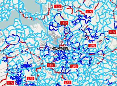
Transport Map
I recently added a new Transport layer to OpenCycleMap, which some of you will have spotted, and I hope you find interesting. The eagle-eyed among you may even have spotted it as one of the maps on Grant's curious OpenWhateverMap!
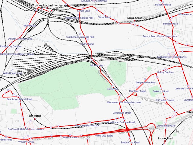
I first visualised bus routes in 2008, and ran a few experiments on railways as part of an experiment in terrain maps just over a year ago. In the mean time I've had these ideas on the back burner while I focussed on OpenCycleMap, but recently made some space to put them together into a fully-fledged project. I'm not the first to make a transport map, with öpvnkarte being a famous but no-longer-updated example, but the cartography is something personal that I have my own take on and I enjoy the challenge of creating special-interest maps. So while taking a break from terrain-data processing I put the transport map together. There are certain features of the map that are drawn directly from OpenCycleMap, and there are new developments that I will eventually re-incorporate too.
One of the phrases I started using a few years ago is "render and they will map" - or, in other words, if you are interested in a particular aspect of mapping data being improved then the best way to encourage mappers to improve that is to make it visible and useful. Certainly after I started rendering cycle routes their number in OpenStreetMap increased dramatically, and similarly for the other specialist things in OpenCycleMap. I'm hoping that my world-wide transport layer will encourage similar things in the area of transport data such as adding greater detail to railway stations. In the UK we have patchy levels of detail in bus stops and bus routes; even in London many bus stops have obvious errors in their names. I suspect since they aren't shown on the current mainstream maps nobody is noticing (and hence fixing) the problems, but, over time, the data should mature and the transport map will therefore improve too.
Another aspect of the OSM data is the high level of detail in the data, which can make some mid-range zoom levels incoherent. I've tackled these in two different ways - for example, railway yards and sidings can be distracting when looking at inter-city rail corridors, but the transport map checks for the appropriate tags to hide them where possible. However, the tags aren't widely used at the moment since they aren't rendered on other maps, but in this way my map will improve over time as the mapping volunteers add ever greater details. In contrast, I've used the station buildings to obscure some of the track details at mid-zoom levels, and gone one step further in simplifying the building geometries at the same time - but losing some of the complex detail of OSM can give better cartographic results. I've got further examples and some experiments lined up, and if my talk is accepted I'll be discussing these at State of the Map Europe later in the year.
For now I'm working on speeding up the rendering - this is the first full-blown map I've made with Cascadenik and the performance is surprisingly poor. I'll be trying to nail down what's causing this and share that with you soon. In the meantime I continue to work on the cartography and I'm interested in your feedback and questions.
This post was posted on 11 April 2011 and tagged General
OpenStreetMap Hack Weekend
Last weekend we held another Hack Weekend for OpenStreetMap, and I thoroughly enjoyed it from start to finish. Especially the start, which involved sitting outside on a warm spring evening with a cold beer and unwinding!
This was probably one of the largest Hack Weekends that we've ran so far - I counted 25 people at one point - and I volunteered to help anyone who was interested in using git, developing Potlatch2 and improving the Rails Port (aka the OpenStreetMap website). As part of this I ran a few short workshops which were surprisingly well attended - I'd expected 2 or 3 people for each one but ended up with 10-15 each instead! I'll be interested to see what workshops people are interested in for the next Hack Weekend.
When I wasn't running workshops or helping other people, I was working with Richard Fairhurst on the Potlatch 2.0 release - and this was the point where we made it the default editor on the OpenStreetMap website. It's been painful for the last few months watching thousands of people learning to use potlatch1, so we've just made a big step in making OpenStreetMap easier to get started with. The news made it onto OpenGeoData and even ReadWriteWeb. Development doesn't stop at 2.0, of course - we've got lots of in-progress work on branches (including the long-awaited History dialog that I've been working on) and it'll be good to see them being merged in when they are ready. We also managed to spot a few bugs within the first few hours of the new release!
It was also great to see a bunch of people committing code to projects they'd never worked on before - one of the main reasons we run the weekends. There was lots of work on the Rails Port, including improving the layout on mobile screens and working round bugs with postgres 9. But I've no idea what everyone was up to at the far end of the room - it was such a big, busy weekend that I couldn't keep track! One thing that was prevalent were people picking up git for the first time, and our recent migration to using git for Potlatch2 proved really useful when juggling which features to include in 2.0 and which to leave for further development.
I'm looking forward to the next Hack weekend, which Matt is already organising. If you're tempted to come help develop OSM and learn something new, you should come along!
This post was posted on 6 April 2011 and tagged OpenStreetMap
The London Streets Challenge
I've been mildly obsessed with the street-name comparison tool from ITO World over the last couple of weeks. It measures how many correctly named roads OpenStreetMap has in the UK by comparing it against the Ordnance Survey's OS Locator dataset. We also get to mark where corrections are needed in the OS data - even they aren't perfect!
According to the combination of the OS data combined with our list of corrections, OpenStreetMap (and hence OpenCycleMap) today has 600,414 correctly named streets - just over 70% of the total. What's more, in the last week alone we added 4,699 more streets - in the last 31 days we've added a whopping 19,309. If we keep this up we'll be done in about 13 months, but I hope we can up the rate even further.
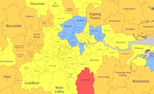
One particularly eye-catching part of the ITO World analysis is the map showing where we have good and bad coverage (unsurprisingly, good in the cities, bad in rural areas - we kinda knew that already). Areas are coloured red through yellow and finally turn blue at the 95% completion level - which throws up a couple of surprises like Orkney and Shetland being blue and Tandridge on the outskirts of London still being red. That lead me to ponder a challenge for our London Pub Meetups:
Every time a London area gets beyond 95% - i.e. turns blue on the map - we'll have a celebratory pub meetup in that area.
We discussed this at the last pub meetup (although Harry is being a bit harsh if we're going to wait for 100%, I reckon 95% is close enough for now!). Not counting those that are over 95% already, we've had our first winner - Barking and Dagenham! Congratulations to all involved, and I invite someone to step forward and nominate a nice pub for the rest of us to come and visit.
If Barking seems like a bit of a trek for you to get to, then that's the motivation to improve areas closer to home!
For the record, there were 9 areas already blue before I opened the challenge - Redbridge, City of Westminster, Camden, Brent, Southwark, Kensington and Chelsea, Barnet, Enfield and Haringey. Perhaps these areas can be opened to the 100% challenge instead!
This post was posted on 2 February 2011 and tagged General
Tweak a little here, fix a little there
Another round of updates to the OpenCycleMap cartography was released a week ago, after a few days of local testing, bug investigating and general "technical-debt" payments.
The biggest fix is that I've finally tracked down what was causing all kinds of problems with riverbanks. The OpenCycleMap code dates back from long in the past when the riverbank tag was first introduced, and since then it's greatly expanded and is now heavily used in multipolygons. There was a bug with some code thinking they were linear features and other code treating them as polygons - which used to work fine, but was recently leading to giant triangles lurching across the landscape. Thankfully it turned out not to be a problem with the relation-handling code in osm2pgsql - I had enough of that last year!
A major feature of this update is the map now treats points of interest - like shops, pubs and so on - equally, whether they are tagged as nodes or as areas. So in hyper-detailed places where shop nodes are being replaced by building outlines the names and icons will now show up properly. You can see some examples around Peckham where Tom Chance has been hard at work.
Another 'technical debt' problem was regarding the "cycle node networks" widely used in the Netherlands and Belgium. When I originally tried rendering the icons at the junctions mapnik blew up - there was a bug with running ShieldSymbolizer on points. Even though this was fixed in mapnik years ago it was only last summer that I started using a new enough version, and it's taken until now for me to reinstate (and redesign) the icons. But the new circles certainly look nicer than just numbers on the map, so it's been worth the wait!
Pedestrian areas are finally drawn properly, and cafés have been added. Bike shops get a new, clearer icon and suburbs and localities are shown. On the attention to detail front, at medium zoom levels national cycle routes are consistently prioritised over regional and local routes, and place names should behave a bit more predictably as you zoom in. And finally street labels won't bend back on themselves so much and should therefore be easier to read.
The server is chugging away at refreshing all the tiles - it'll take a week or so to get through them all, but you can see the updates filtering through already in the most popular areas.
Many thanks go to MotionX for supporting the project and this round of updates in particular, and to everyone who diligently filed bug reports and (gently) encouraged me to fix them!
This post was posted on 31 January 2011 and tagged OpenStreetMap
Tiger Edited Map resurrected
Recently I've been working with MapQuest to rebuild the OpenStreetMap "Tiger Edited Map". It was publicly released last week (blog, link).
The original map was created by Matt while he was at CloudMade, but it disappeared not long after we left at the end of last year. This is a from-scratch reimplementation with a few bonus features - it's updated every few minutes, and the stylesheets are available on GitHub. It uses osm2pgsql with extended attribute information to enable styling by openstreetmap id and date ranges (see the nitty-gritty here) - and a word to the wise: don't turn on extended attributes for nodes unless you have infinite hard drive space and patience to go with it!
It's great to see how much progress there's been this year, and it shows where we need to check for the usual TIGER issues. One of the interesting things for me is that it shows a recognisable editing pattern across the entire US - the major roads have all been edited (most multiple times), as have vast swathes of urban areas - enough that OSM is a distinct enough dataset from TIGER to stand out on its own. Hopefully this will inspire more people to fix up the streets in their own areas and drive the quality of OSM data in the US upwards - step by step. My next plans along these lines is to work on the Rapid Assessment Tool I made some time ago - moving along the QA debate from the origins of the data (I believe we're often too hung up on the word "TIGER") and onto assessing how good OSM data is on its own merits.
If anyone has any suggestions for improvements to the style - especially changes to the detection algorithm, or similar ideas for other regions - then I'd love to see either forks from the git sources or even plain old comments below!
This post was posted on 27 October 2010 and tagged OpenStreetMap
subscribe via RSS